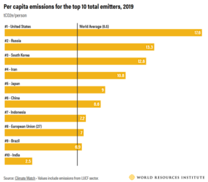
How to find relevant climate data (ext. 🔗)
How to find relevant climate data (ext. 🔗) https://www.johannes-friedrich.com/wp-content/uploads/2023/08/Figure-3-An-incomplete-overview-of-major-climate-change-data-platforms-websites-1024x761.png 1024 761 Johannes Friedrich https://www.johannes-friedrich.com/wp-content/uploads/2023/08/Figure-3-An-incomplete-overview-of-major-climate-change-data-platforms-websites-1024x761.pngA new tool helps users navigate the many open climate data platforms available and identify the most relevant platforms for their work.
read more